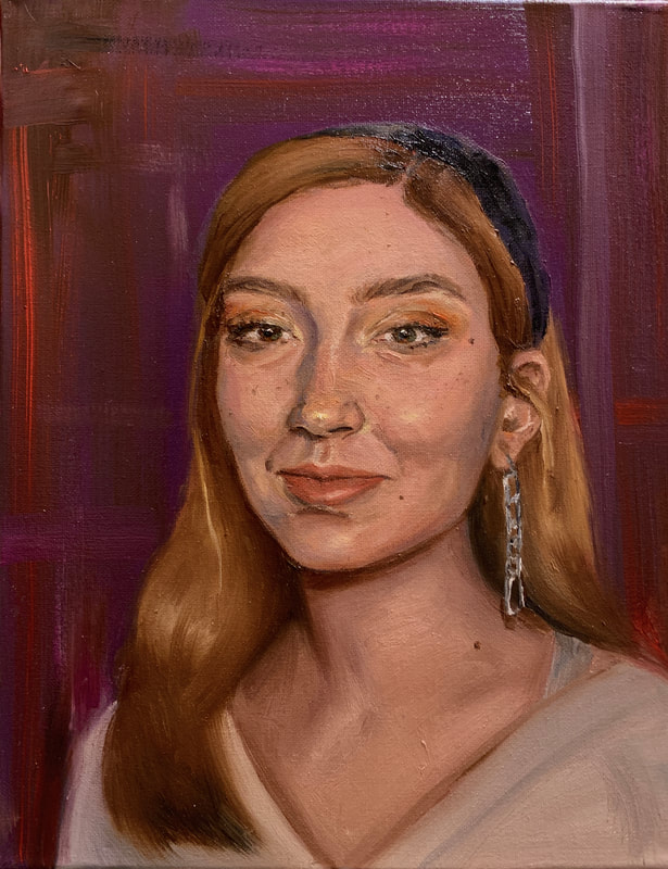
Final Choice Painting
|
|
Class Reflection
Being in AOIT I don't usually get to take art classes so this is my first art class since freshmen year. Considering I want to go to college for art it is surprising for anyone I tell that I haven't taken many art classes. I'm just in AOIT because my brothers were in it in high school so my mom made me do it and by Junior year when you actually kinda figure out what you want to do you're in too deep to quit so you just deal with and it's good for college i guess. In this class I did a lot of painting practice that I am very grateful for. When I wasn't in any art classes I would just go home and paint or draw everyday and usually just not do my homework, but having an art class during school is really awesome and it's almost like a mental break from all my academic classes that I hate strongly. I learned many techniques and how to manage my time painting. I've made amazing friends in this class since it's such a good and nice environment to make friends in because everyone has the same interest it makes me even more excited for college when I make even more friends with my interest. In this class I wish we could have a little more freedom in our projects with some less strict assignments, like in Ms. Purtee's class so we could have some more items to put in our portfolio because I can't put any of these in my portfolio because it is too overdone/basic and colleges do not care that I can paint trees or a dog. I understand the reason of doing this to develop skill, but when applying to art colleges they care more about you creative ideas instead of your technical skill because you develop a lot of you technical skill at college. And for others who aren't applying to art colleges and don't necessarily need creative projects it's definitely more fun to paint something you are interested in and made up yourself then something that will look just like everyone else's in the class. I definitely had the most fun painting my choice painting and I'm sure most others will say the same. I really loved this class thank you!
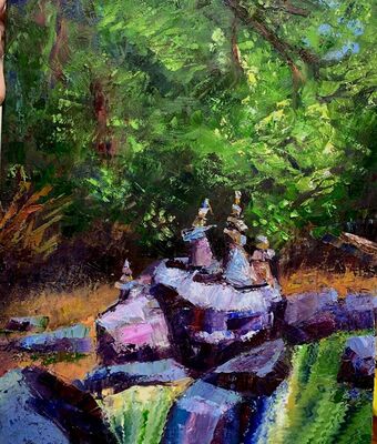
Landscape painting
The craftsmanship of my painting is detailed, but still loose. I like all the texture and there is a whole spread of different colors. The colors of the piece are mostly cool blue, greens and purples but also has some red and oranges in the bark and sand. There are also yellows in the leaves to make the one most lit section pop.I created contrast with my painting by having the leaves Be very dark and then going lighter & lighter in the well lit part of the forest. Also on the rocks there is light blues right next to the darkest dark purple catching the eye. The texture highlights and shadows are used to enhance the work to make it pop and attractive to the eye with the bright contrasts and flashy colors that bring your attention to the center of the painting with the rocks and bright leaves. The texture in person is very chunky and adds to the eye catching effect. I added depth in the painting with texture and highly contrasted and exaggerated lights and dark in the pebbles and leaves. Something that made my painting techniques successful was using a palette knife for the bottom water bit and to scrap on the paint at the rock parts for a rougher look. I also used the palette knife on the leaves after the medium green dried and I added a very yellow green on top of it. Difficulties I encountered to was creating detail with the palette knife. I solved that by using a brush to clean up parts. The success I had with this painting was creating a bright flashy landscape that will brighten up a boring room like my bedroom.
The craftsmanship of my painting is detailed, but still loose. I like all the texture and there is a whole spread of different colors. The colors of the piece are mostly cool blue, greens and purples but also has some red and oranges in the bark and sand. There are also yellows in the leaves to make the one most lit section pop.I created contrast with my painting by having the leaves Be very dark and then going lighter & lighter in the well lit part of the forest. Also on the rocks there is light blues right next to the darkest dark purple catching the eye. The texture highlights and shadows are used to enhance the work to make it pop and attractive to the eye with the bright contrasts and flashy colors that bring your attention to the center of the painting with the rocks and bright leaves. The texture in person is very chunky and adds to the eye catching effect. I added depth in the painting with texture and highly contrasted and exaggerated lights and dark in the pebbles and leaves. Something that made my painting techniques successful was using a palette knife for the bottom water bit and to scrap on the paint at the rock parts for a rougher look. I also used the palette knife on the leaves after the medium green dried and I added a very yellow green on top of it. Difficulties I encountered to was creating detail with the palette knife. I solved that by using a brush to clean up parts. The success I had with this painting was creating a bright flashy landscape that will brighten up a boring room like my bedroom.
|
|
|
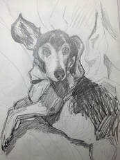
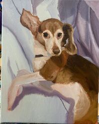
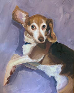
Pet Portrait
I accomplished value with having very dark browns and very bright whites and everything in between throughout the painting like the back of the fur and the whites on the face. Layering medium colors and then adding little highlights creates a look of fur I did this mostly on the white parts of the fur rather then doing a million individual strokes which frankly I am just too lazy to do. I like the look of just painting the colors of the fur I saw. The background I was going to do sheets as you can see I started in the half way done progress but it kind of failed at other portions and I had no more class time to work on it so I just made it look like a smudgy light purple background which I think looked fine in the end and makes the focus more on the dog. If I did the fabric background it would look too noisy and confuse the eye. I have never painted an animal so I think I grew a lot throughout this painting.
I accomplished value with having very dark browns and very bright whites and everything in between throughout the painting like the back of the fur and the whites on the face. Layering medium colors and then adding little highlights creates a look of fur I did this mostly on the white parts of the fur rather then doing a million individual strokes which frankly I am just too lazy to do. I like the look of just painting the colors of the fur I saw. The background I was going to do sheets as you can see I started in the half way done progress but it kind of failed at other portions and I had no more class time to work on it so I just made it look like a smudgy light purple background which I think looked fine in the end and makes the focus more on the dog. If I did the fabric background it would look too noisy and confuse the eye. I have never painted an animal so I think I grew a lot throughout this painting.
|
|
|
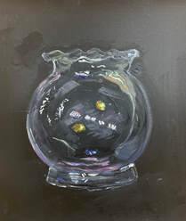
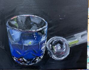
Glass painting
I learned a lot from doing this project and how it is difficult to paint glass realistically because you have to think about all these different layers and also the extremely reflective ice scoop is another extremely challenging thing to recreate because it all depends on the surroundings and what is reflecting off of it. A similar thing happens with glass but it is also transparent. I think I executed these items mediocrity because there are so many elements to think about. My favorite part is where you can see the spoon reflecting on to the glass. The contrast of the black background really makes the highlights reflecting off the glass pop and I think that adds a lot to the piece. The over all piece is more abstract because I was unsure how to execute parts of the glass so I just made more parts loose and abstract. I also like the bottom of the glass there were a lot of lights and colors. The background seemed pretty empty so I added some color splotches randomly which turned out to look more like rainbow lights reflecting on the background which I love. It made my piece stand out.
I learned a lot from doing this project and how it is difficult to paint glass realistically because you have to think about all these different layers and also the extremely reflective ice scoop is another extremely challenging thing to recreate because it all depends on the surroundings and what is reflecting off of it. A similar thing happens with glass but it is also transparent. I think I executed these items mediocrity because there are so many elements to think about. My favorite part is where you can see the spoon reflecting on to the glass. The contrast of the black background really makes the highlights reflecting off the glass pop and I think that adds a lot to the piece. The over all piece is more abstract because I was unsure how to execute parts of the glass so I just made more parts loose and abstract. I also like the bottom of the glass there were a lot of lights and colors. The background seemed pretty empty so I added some color splotches randomly which turned out to look more like rainbow lights reflecting on the background which I love. It made my piece stand out.
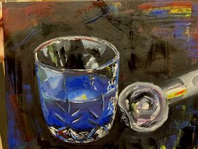
Oil Paint Practice (left: brush & right: palette knife)
|
|
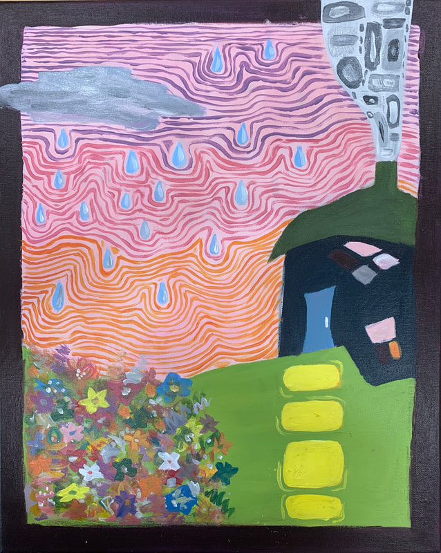
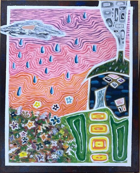
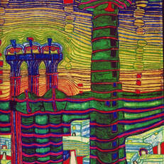
Acrylic Hundertwasser Inspired Painting
|
|
|
|
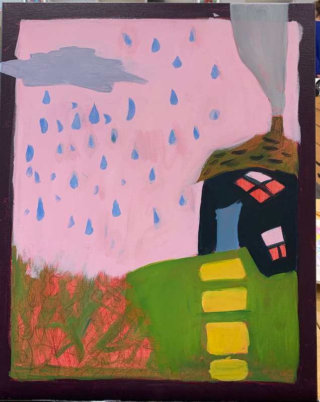
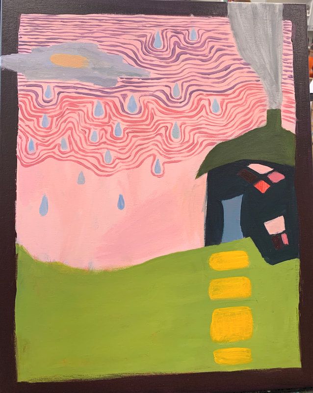
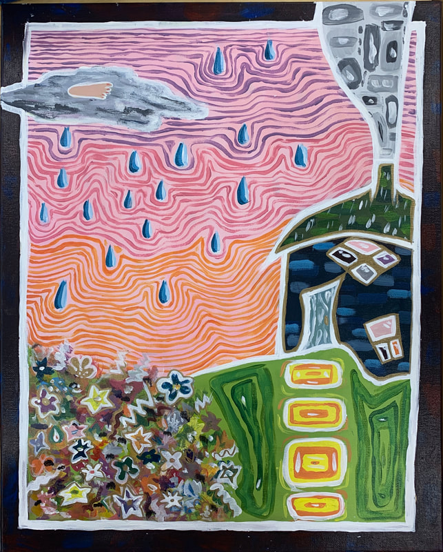
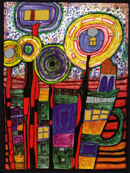
Final painting ->Reference Hundertwasser paintings:
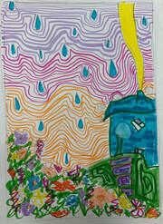
Color sketch:
|
|
Critique
1.) The craftsmanship of my piece was pretty messy and careless. This is because I don't have much passion for abstract art and I just do things messy either way. I just don't think my brain is built to make abstract art I don't really understand it, but I definitely wish I could do it better.
2.) The art style is shown by the bright colors, simplistic building, and chaotic energy from the piece like Hundertwasser paintings usually have.
3.) I used analogous colors in the sky because Hundertwasser used analogous color theme in his work a lot because with all the chaos it is pleasant to look at those colors together.
4.) I think the focus point of the painting is the building because the darkness of the building against the lighter sky makes it pop out.
5.) I used gold and silver sharper to embellish the painting (you can't really tell in the picture) in the cloud, smoke, & on the house.
6.) I put a boarder with a dark purple and then outlined everything with white because it looked very messy without it. The boarder I just left dark purple & white because if I added a pattern around it would be too distracting/loud. I did add slight red and blue paint strokes on the dark purple boarder just to have it not be a solid color. (& maybe look like space? for no reason).
It emphasizes the piece because without the boarder it looks like a kids drawing.
7.) The difficulties I had with the piece were almost everything. I never have confidence with abstract art & always feel like my ideas are dumb or done a million times, even though for everyone else it seems to come at such ease. I couldn't come up with any sketches I liked & I didn't want to do skyline city scene like everyone else did (but ended up doing an even more basic piece). I wasn't really happy with the turn out of the painting.
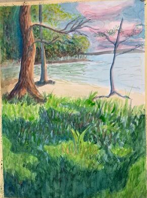
Watercolor Landscape Final
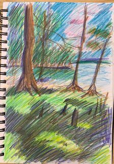
Prismacolor sketch of final painting
|
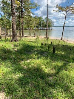
reference
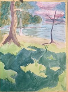
One class period of painting
|
two class periods of painting
|
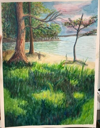
The final piece done on the third day
|
1. What watercolor techniques proved to be effective in your painting? How and Why?
For leaves and grass a repeated flick for the grass and dots for background leaves. I used many layers to make it look like thick nature, even adding seemingly random colors like orange and purple to make the grass and leaves have depth and to make it look more interesting.
2. How important was using transparent layers in your painting?
Very important because I used the first thin layer to plan out where all the things will end up.
3. Explain how your composition was successful? Did you utilize all the elements of art and principles of design? Explain.
My composition was successful because I tried not to make things symmetrical or have things be right in the center of the painting. and the water line does not start across the half of the painting.
4. Was color choice an important factor in the overall success of the painting? Why?
Yes because your color choice determines if something is in a shadow or if it is far away or close up.
5. Describe your craftsmanship
When I start a painting I'm excited about I finish it pretty fast or as fast as I can because it is so fun and I love adding details at the end of paintings which is difficult to do with watercolor.
6. If you were able to do something different what would it be and why?
I would add less leaves in the back and make the tree a different shape because it looks kind of unnatural.
7. Explain to me what you have learned about watercolor and how it has improved or discouraged your development in art?
I learned that you can make things dark and vibrant even with water color you just have to be patient.
|
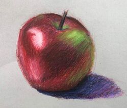
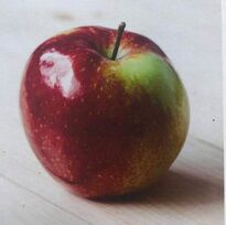
Prismacolor copy of apple. This is my first time using Prismacolor pencils because I have only ever taken Art 1 and that was freshmen year.
Next time I will remember to leave the highlight lighter. |
|
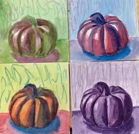
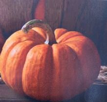
This is my water color color study of a pumpkin. The top left is complimentary colors so I used lime green and violet. The top right is analogous color scheme So I used blue, violet, and blue. The bottom left is primary color scheme (red, blue, yellow). Lastly, the bottom right i monochromatic where I just use purple. I could have done better, but I was getting impatient with the water color drying and having to do the same thing over and over.
|
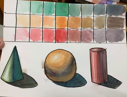
This is my water color value study of three different colors (green, orange-yellow, and red).
